DENVER ZOO REDESIGN
INTRODUCTION
SUMMARY
For this project, I assessed the user experience of the Denver Zoo's website and proposed a redesign. The current site is confusing and time-consuming, making it difficult for users to buy tickets. The redesigned version streamlines the ticket purchasing process, making it more efficient and user-friendly.
MY ROLE
I was the only designer and researcher for this project, this included conducting user tests and creating low, mid, and high-fidelity designs.
CHALLENGE
Denver Zoo visitors need a way to purchase tickets quickly and easily online because the current process can be confusing and time-consuming, and they want to streamline their experience to enjoy more of their time at the zoo.
RESEARCH
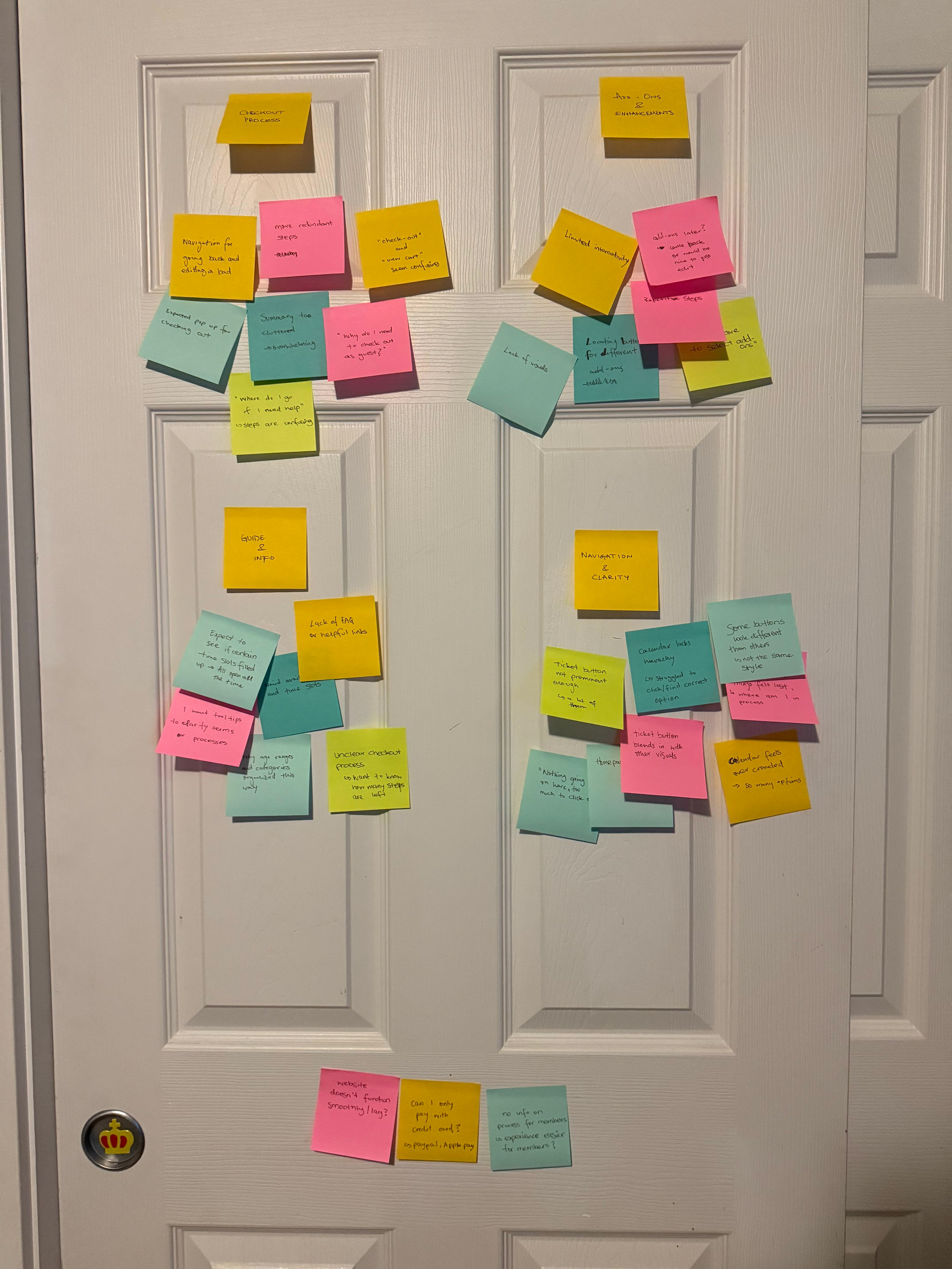
USER TESTING OF CURRENT EXPERIENCE
To evaluate the Denver Zoo’s current ticketing experience, I conducted usability testing with five participants who met the screening criteria. Each participant was guided through purchasing tickets on the website while I observed their interactions and collected feedback.
Key pain points:
- Overcrowded homepage that made it difficult to prioritize actions
- Lack of clarity in ticket categories, and inconsistent visibility of important buttons, frustration with calendar
- Lack of feedback after adding items to the cart and the cluttered cart summary
- Lost track where they were in the ticket process, took too long
From these findings, I identified opportunities to streamline the homepage navigation, provide visual clarity for ticket options and add-ons, improve confirmation feedback during the purchase process, and enhance the cart’s organization for a cleaner user experience. Overall, participants highlighted the need for a clearer, more intuitive flow that reduces confusion and decision fatigue.
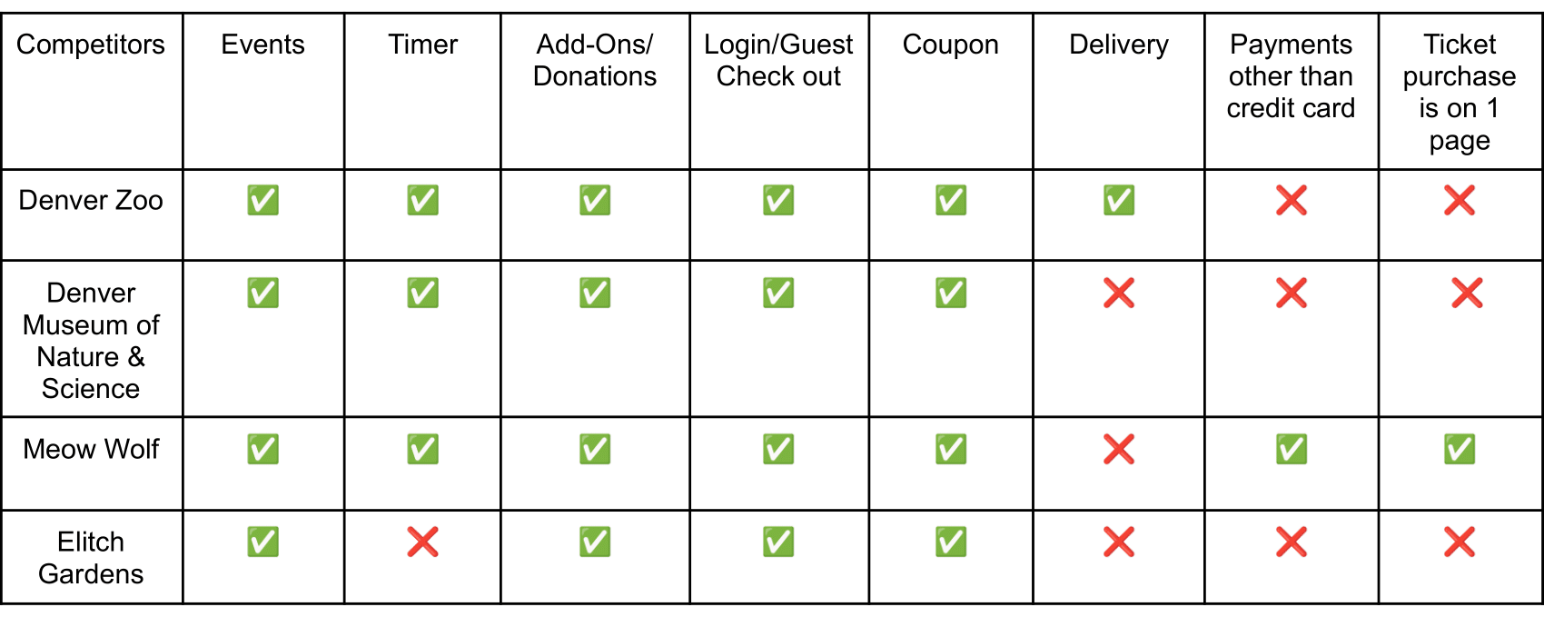
COMPETITIVE ANALYSIS
I conducted a competitive analysis for the Denver Zoo, comparing its website to those of the Denver Museum of Nature & Science, Meow Wolf, and Elitch Gardens. This helped identify strengths and opportunities for improvement in the Denver Zoo’s digital experience.
How might we statements:
1. How might we make the homepage and ticketing navigation clearer to help users find what they need quickly?
2. How might we improve the add-ons page to provide better visuals and a more intuitive selection process?
3. How might we streamline the cart and checkout experience to ensure clarity and reduce user confusion?
DESIGN
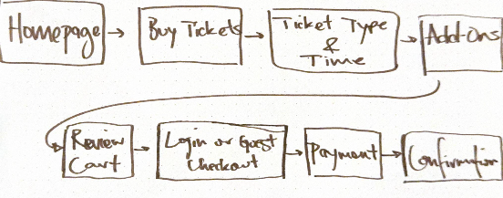
USER FLOW
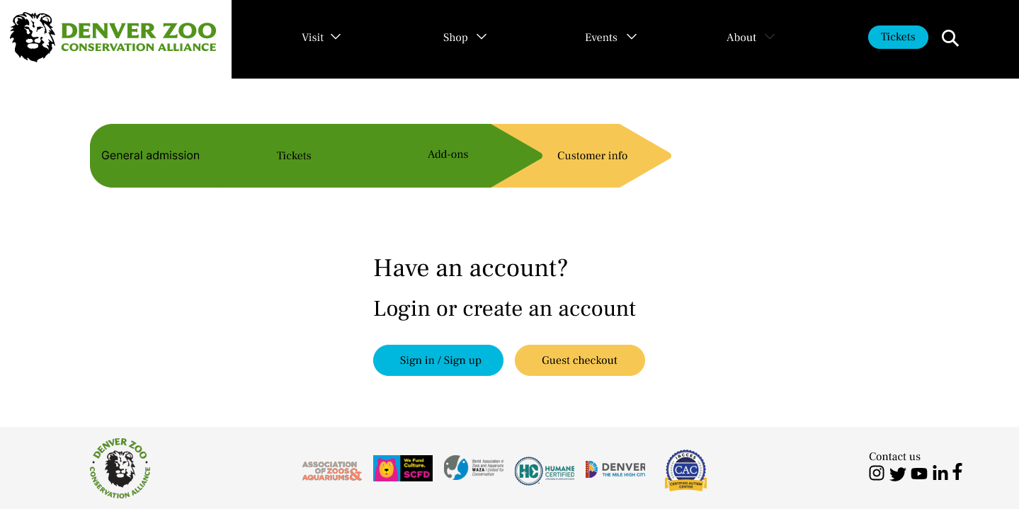
For my user flow I created a flow that simplifies the purchasing experience while addressing user needs. The flow starts from the Homepage and guides users step-by-step through selecting tickets, choosing add-ons, and reviewing their cart. I included a Login or Guest Checkout option to provide flexibility for both returning and new visitors, reducing friction at checkout. A dedicated Review Cart step ensures transparency, while the final Confirmation page reassures users that their purchase is complete. This design prioritizes ease of use, minimizes confusion, and enhances opportunities for upselling add-ons without disrupting the user journey.
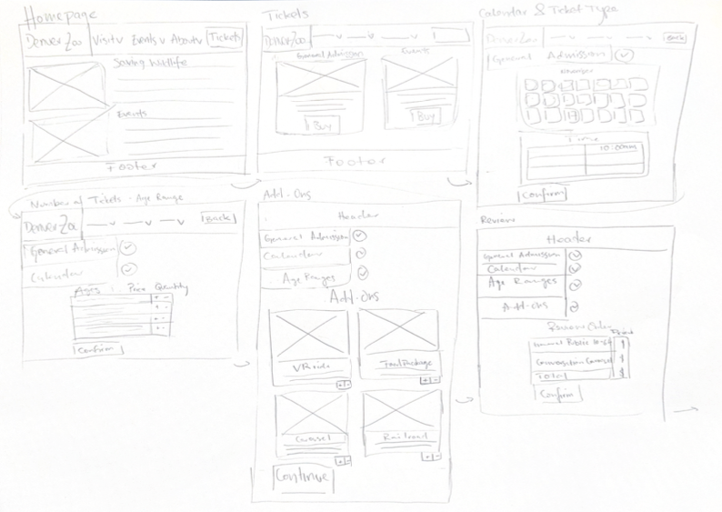
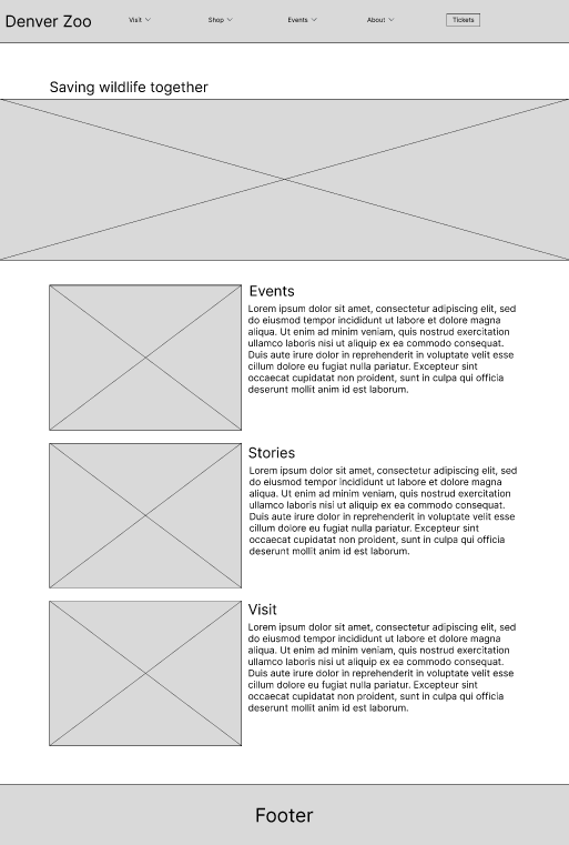
LOW FIDELITY WIREFRAMES
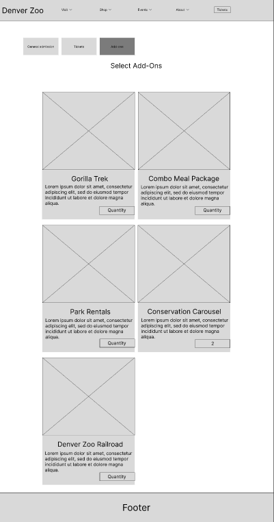
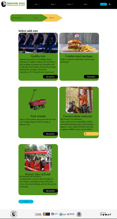
I designed a series of wireframes that map out each key step of the user journey. Starting with the Homepage, users can easily navigate to ticket purchasing options, including general admission and events. The process continues with a Calendar & Ticket Type selection, a clear interface for choosing dates, times, and quantities of tickets. A dedicated Add-Ons page allows users to enhance their visit by selecting additional experiences, such as VR rides or food packages. Finally, the Review & Confirmation step ensures transparency and accuracy before completing the purchase, creating a smooth and user-friendly experience.
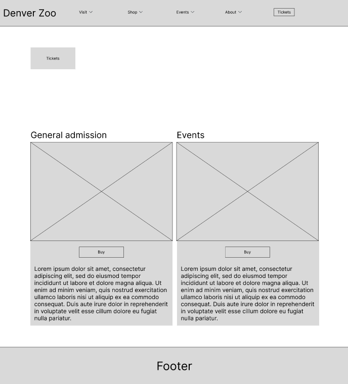
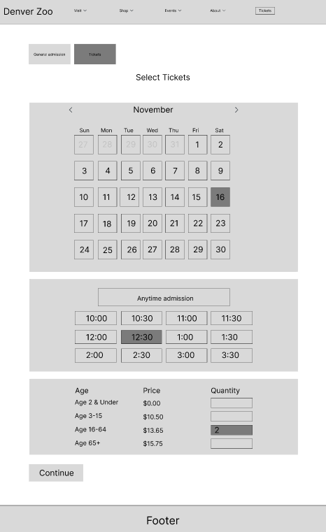
MID FIDELITY WIREFRAMES
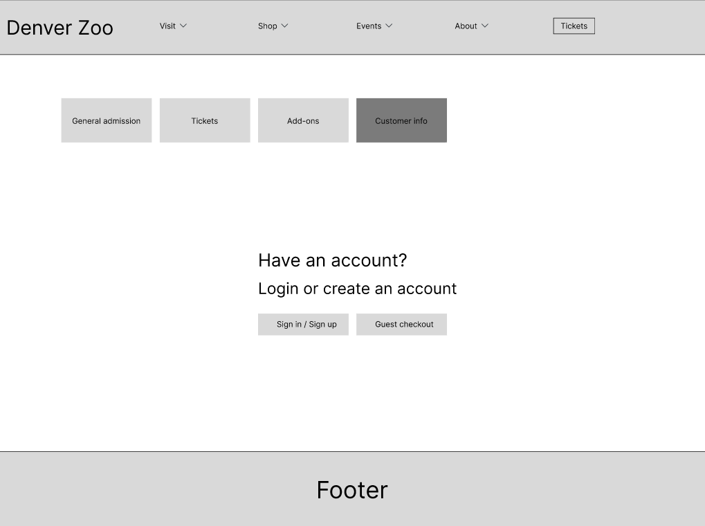
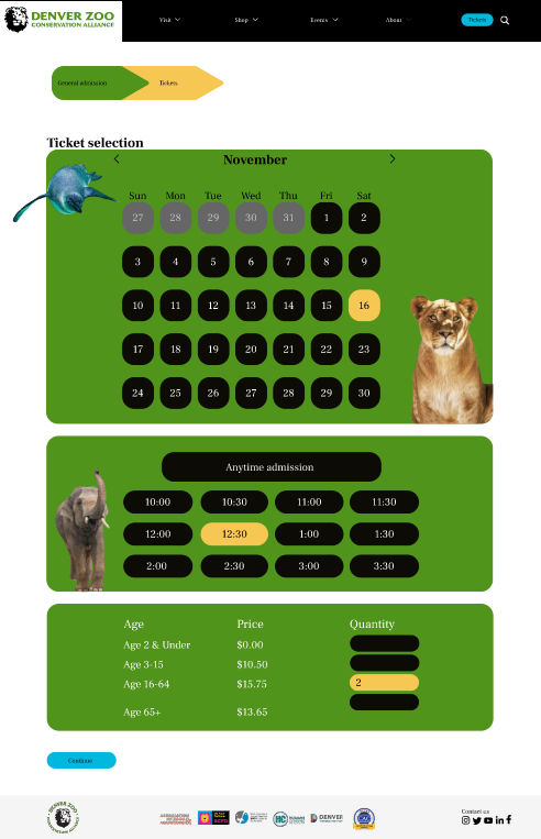
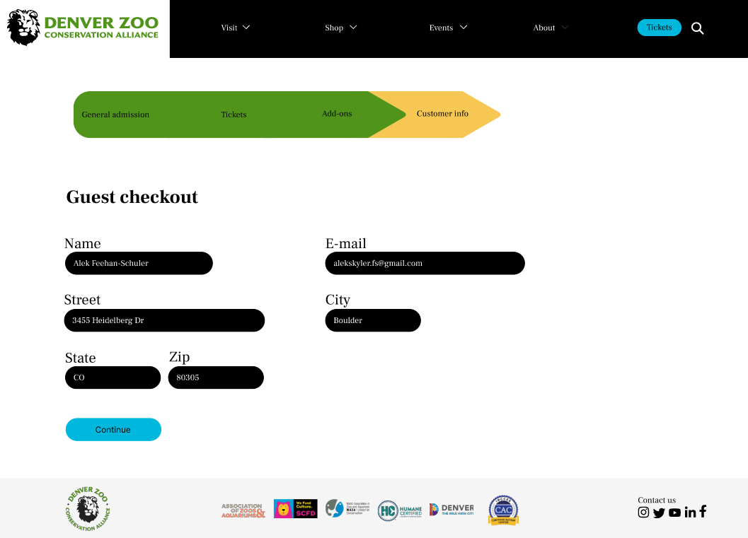
For the mid fidelity wireframes I focused on refining the layout, hierarchy, and clarity of each step to enhance the user experience. I improved navigation by adding a clean top menu bar and a progress stepper, allowing users to seamlessly move through stages like General Admission, Tickets, Add-Ons, and Customer Info. The ticket selection interface now features a calendar and time slots, making it easier to pick dates, times, and quantities intuitively. I also included a streamlined Guest Checkout process, reducing friction for users who don't want to create an account. The final Review Order page provides a clear summary of ticket details, add-ons, and user information, ensuring transparency and building confidence before purchase. These changes focus on usability, clarity, and user satisfaction.

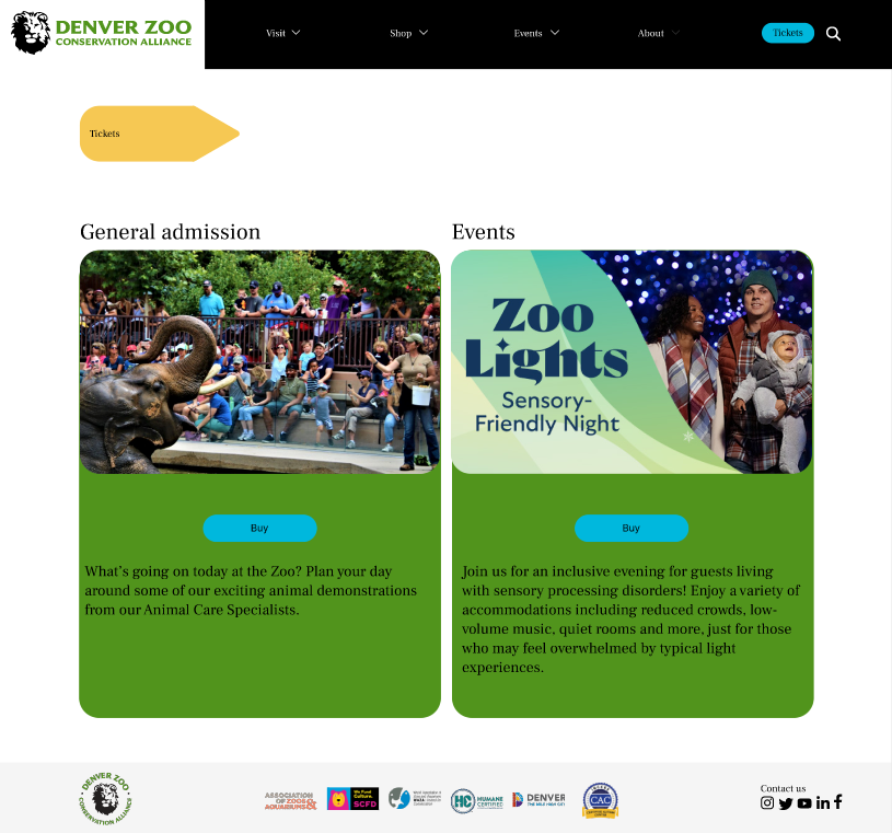
HIGH FIDELITY INTERACTIVE PROTOTYPE
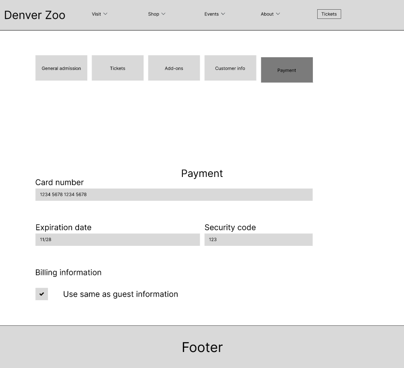
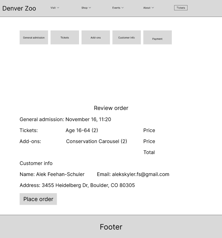
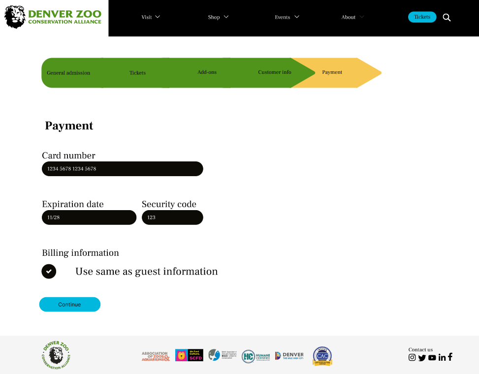
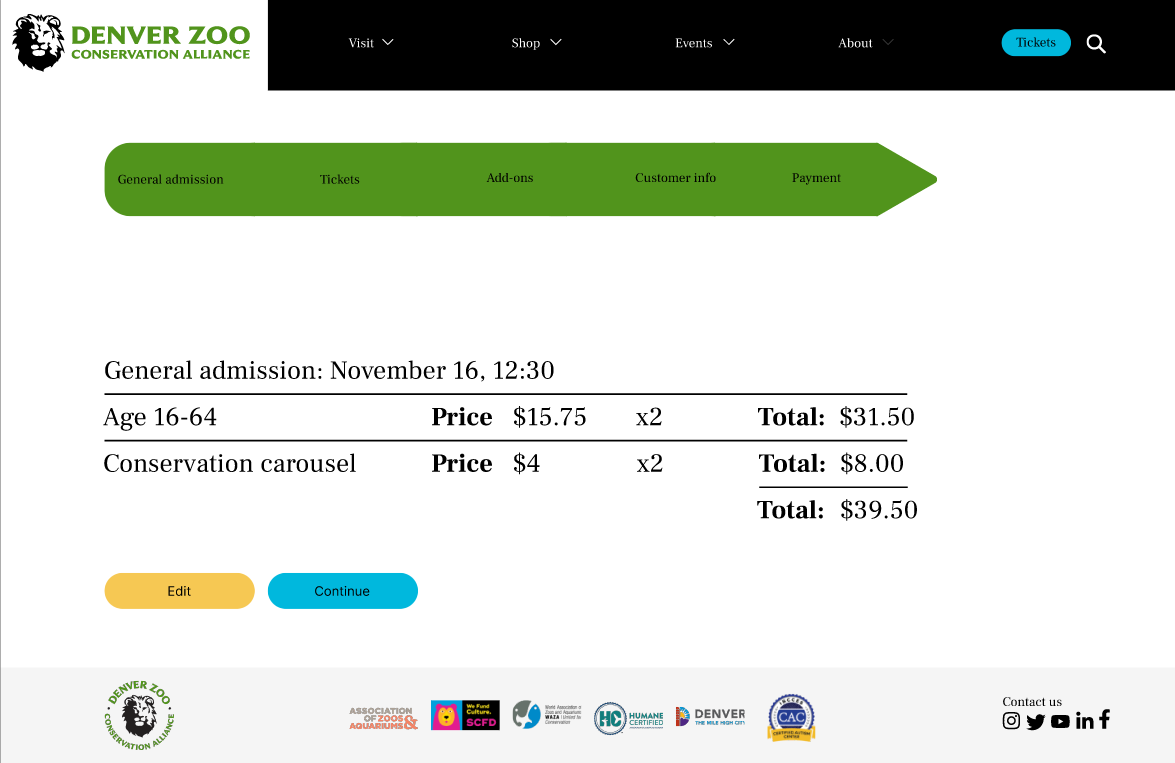
For my high-fidelity prototype, I designed an intuitive and visually appealing ticketing system for the Denver Zoo. I focused on creating a seamless user flow, starting with ticket selection and progressing through add-ons, guest checkout, and payment. The interface emphasizes clear navigation, efficient functionality, and engaging visuals, ensuring an easy and enjoyable user experience. Add-on features like the "Conservation carousel" and other attractions are integrated to enhance upselling opportunities while maintaining clarity.
INSTRUCTOR FEEDBACK
Throughout the design process, I received detailed feedback across all stages of fidelity.
Low fidelity wireframes, I was advised to use sentence case for text, wireframe entire pages (not just desktop views), consider a progress stepper instead of accordions, and improve usability by allowing users to type in quantities. Additionally, I was reminded to include versions of pages with both empty and filled fields for user input. Based on this, I adjusted my mid-fidelity design to incorporate a progress stepper, improved input field usability, and made complete pages.
Mid fidelity wireframes, I received comments on spacing consistency, most importantly following increments of 8, ensuring a 72px gap from the last element to the footer, and improving text hierarchy. I applied these changes by standardizing spacing across all elements, refining text hierarchy for clarity, and aligning components to maintain uniformity.
High fidelity prototype, feedback focused on sentence case, AA color compliance for buttons and text, left-aligning text, and improving structure on the review page. I addressed these points by ensuring all text adhered to sentence case, aligning text consistently, verifying color contrast met accessibility standards, and enhancing the layout of the review page for a cleaner structure. These iterative improvements resulted in a polished and user-friendly final design.
EVALUATION AND RESULTS
USER TESTING PROCESS AND PAIN POINTS
For this round of user testing process, I conducted two usability tests on my high-fidelity interactive prototype with participants aged 18-65 who had previously visited a zoo. Using a prepared discussion guide, I ensured each screen of the prototype was evaluated through targeted questions. During the testing I observed and took detailed notes on user interactions, focusing on their feedback and identifying pain points. This process provided valuable insights to improve the design and usability of my prototype.
First user was confused by the nav bar. Thought they could click on Visit to buy tickets. They were also overwhelmed with a lot of things happening on the homepage but understood that the homepage is there to showcase everything going on at the zoo.
The second user felt the pricing and ticket purchasing process chaotic and confusing, especially how they were supposed to select 2 tickets and then enter all of their information without being able to do so. The user felt the confirmation screen could be laid out better, in a more visual way to check if all of the information is correct.
UPDATES
Based on this feedback, I plan to redesign the homepage to include a more intuitive nav bar with a clearer "Get Tickets" button. I will do so by making a strong contrast of colors between the primary button and nav bar.
From this feedback I will move around the spacing of my elements on the pricing page and organize them in a way that makes more sense. It doesn’t have to look like a table and the price isn’t needed. For the confirmation page I will follow the same style as previous pages and reorder the hierarchy. Based on what the user inputted first: tickets, add ons and total price will show up first, then customer information which will ensure users feel confident in their purchase.
REFLECTION
FUTURE PLANS
If I had more time, my next steps would involve more design elements in my prototype. The Denver Zoo has nice background colors, I would have liked to include this so the background isn't white. Additionally, I would explore alternative design patterns, such as enhancing the progress stepper and input fields, to improve the overall user experience and easier ticketing process.
CONCLUSION
As this was my first UX project, I learned the importance of all the UX research and design steps and incorporating user feedback at every stage to create an effective and user-friendly interface. I learned that creating wireframes and high fidelity prototypes take a lot longer that I expected and I was always messing with the spacing. This project showed me how important usability testing is and how even small design tweaks can make a big difference in improving the overall user experience, making the experience as easy and efficient as possible.